
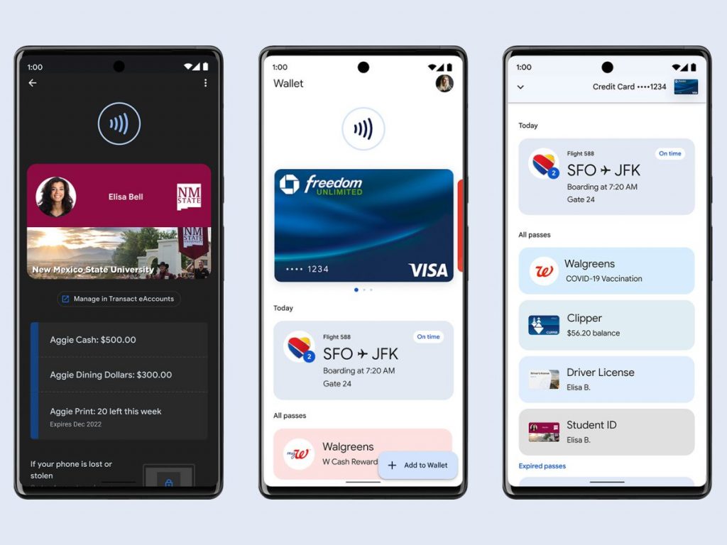
As we all know the Google Wallet app is very simple with a lot of empty space, with its renewed design trying to solve exactly this problem.
As 9to5google reports, the app still starts with the Google Wallet label and the profile photo at the top. However, credit and debit cards now appear instantly, as Google has removed the NFC animation. The carousel is improved so that the cards no longer appear side by side, but one behind the other, while below we find the name of the bank and an NFC signal.
Compared to the previous design, the empty space below the carousel has also been removed and you can now see any passes.
It is worth noting that the new Wallet design will appear in the 2.193.x version although it has not yet made its debut widely.
0 Comments